Sue's Adventures in Fontland
Skip to the end and read - Success (almost}
Latest Attempt - March 2005
If you have a fairly new HP laserjet printer,please
try my latest attempt at a printable puzzle.
Open another window in your browser and type in location
http://www.doublecrostic.com/test/bgo.pcl
download the file, saving it in some directory perhaps c:\sue
open a DOS window, and type
copy c:\sue\bgo.pcl lpt1
and perhaps the puzzle will print as designed.
If anyone tries this, please contact
me and let me know how it looks. Or mail me a copy.
Or, if you fail, let me know what kind of printer
and operating system you have.
This is a better typeface and more compact
file than I have used before. However, the format
is experimental. The cross referencing indicates quote
word number rather than quote letter position. Please
try it and see if you find the adjustment easy enough.
This method saves a lot of space and facilitates the
use of a much better font. Also, the sample is a
previously unpublished puzzle.
Motivation
In a week, I will have published 1000 double
crostics online. I hope. Anyway 999. Actually,
lots more counting the variety puzzles. But I
do have fears about puzzle 1000: is P1k perhaps analogous to
Y2k? Will it refuse to appear on time due to my own sloppy
programming?
Time is on my mind in another
context as well. While doing research online in
connection with finding the perfect print method,
I find that it is very hard to tell whether information is up-to-date.
Are links recommended simply because they
read well, or because they actually bear fruit?
And please be warned: this column is in the same
unreliable tradition. Except I do date my pages.
So anyway, I am currently obsessed with
the idea of turning the 1000 puzzles into a
saleable asset, clearing my mind (and possibly
my database and website) of the old stuff and
making room for the new. Ron Stoner suggested
a mammoth printed book. Without lots of orders,
I think the cost might be excessive. Also, some
people might like to do the puzzles while offline.
So a CD-Rom with printable (do-it-yourself!) and
playable versions seems like a perfect idea.
(Think holiday gifts!). Joe Buccino has done some
testing of downloaded batches of puzzles and been
delighted with them, since he could work them during
his frequent airplane flights. If anyone has
created CD's and has advice to offer, please
send it.
I have always said that if there is any profit in
any of these ventures, I intend to split it with
the constructors. However, the likelihood of
profit is ever receding.
PDF
I wonder if PDF is not the obvious answer.
But it has disadvantages too numerous to explain here.
Printing a PNG Image
For my puzzles, I need a clear monotype font with
thickish letters that are easily visible at small
sizes when printed. Since it is convenient for the
arbitary web user to look at a puzzle file
onscreen before deciding whether to print it,
Truetype seems a good choice. MSGothic is not a bad
typeface for me when I use it on my own Windows
computer. I created this png file using a PHP script
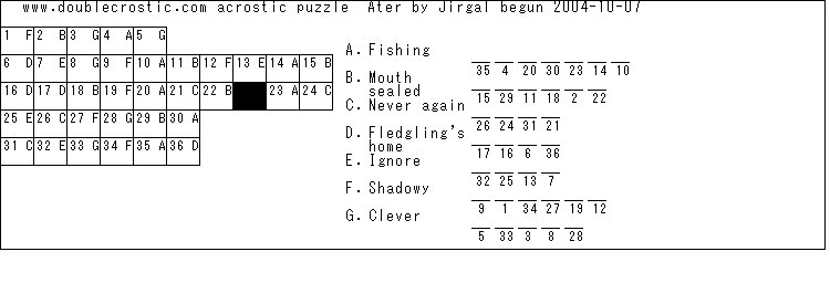
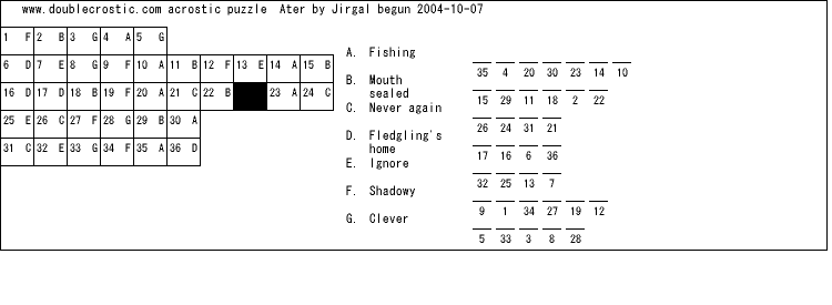
with GD and ImageTTFText and MSGothic font:

However, running the same script from the PAIR Unix
web server that I use, creating
the puzzle screen directly, and saving - we get:

What is this awful font and where did it come
from? I had downloaded the same MSGothic.ttc file
to PAIR that was used on my computer, but clearly
that is not what was used.
I am not actully full satisfied with MSGothic.
I would prefer thicker, blacker letters. If
I find a better font will it work on both machines?
Let alone when printed by an arbitrary user!
Another option is to used the fonts bundled with
the code to create the file (the Boutelle GD module
in PHP). Tiny (5x8), small (6x12), mediumbold (7x13),
large (8x16), Giant (9x15 Bold)
Now go and actually print this page. You will see
that the text portion looks beautiful, but even
the first puzzle is muddy. The curved letters have
clouds of black dots, and the diagonal lines have
the characterstic Windows ratchety look. (I often
wonder why Microsoft did not choose a name without
a W for its operating system - when the W so
glaringly illustrates the failure of digital approximations).
Am I barking up the wrong tree, trying to
use Truetype and PNG and PHP and GD on a PAIR Unix server? Even with a better font,
would my results be unsatisfactory?
Printing from a printer file
I was able to actually use my desired font
by printing to a file with the Printer commands
in PHP.
NOTE: Skip this paragraph unless you want to create
print files yourself. Although printing to a file was easy
under DOS, I had to get to Microsoft Knowledge Base
Article ID : 119256,
"Setting Automatic Printing to a File Name in Windows NT,"
to do it now. I create a second copy of my printer,
setting the port to a filename. How bizarre is that!
Port=c:\printing\fname.txt. Now I select this as my
default printer. And on my local computer I run my
PHP script, which creates a PJL (Hewlett Packard) format file called
fname.txt . I change its name to aterFile.txt and upload it.
(note- be sure it is a binary transfer).
Now you can see the puzzle in the fonts I chose,
provided that you have a printer that reads PJL as well as PCL.
(I think this means newer laserjets but not deskjets or older lasers.)
Open another window in your browser and type in location
http://www.doublecrostic.com/aterFile.txt
download the file, saving it in some directory perhaps c:\sue
open a DOS window, and type
copy c:\sue\aterFile.txt lpt1
and perhaps the puzzle will print as designed.
If anyone tries this, please contact
me and let me know how it looks. Or mail me a copy.
Problems may still exist with this method.
The print files are very large. Possibly because I
am changing back and forth between two fonts. (But that
does not appear to be the reason). Or perhaps because
each character is stored in a bitmap
format. And MSGothic has a large bitmap for each
character, plus many characters are defined. I do
not know whether any of these factor are problems.
Or could I download the fonts to the printer and
then work from character format files? Do I need
to use PCL to do that? Or is a high-level HTML
or Postscript method also possible? Plus why
are my printer output pages so streaky? I have now
shaken the cartridge to distribute the ink, including
some on the floor and the printer case. However the
pages look better.
MS Gothic, Lucida Console, about Helvetica Bold?
I have that in afm format but I have only used TTF or gdf
successfully.
Printing from a PCL File
Using PCL may be most clunky to code but should
give best control, smallest files. And I am at heart
still an assembler programmer. The big problem is that you
cannot debug the PCL without actually printing
because there is no reliable matching screen image.
OK, an attempt at making a PCL file directly.
see if you can download to directory sue
http://www.doublecrostic.com/airy.pcl
and print from a dos window
copy c:\sue\airy.pcl lpt1 /b
The font selection algorithm used by PCL is so complex
that you really do not know what you are getting.
I think there are three possible solutions:
1. Explicitly download the bitmaps of the characters
I want in the size and font I want. One copy of each
to be used throughout the document. I used the
technique specified by Procon for its HVraster font.
The file format is SFP - seems similar to GDF,
also very simple.
It worked but I do not like the font -slashed 0 and
l has a curved foot.- result is procon.pcl in c:
I tried the same thing with a TTF file and the
DOS copy caused multiple lousy printing, not download.
Similarly with attempt to download ATM (Helvetica)
2. Possibly- use Truetype fonts and turn off
"Substitute With Device Fonts" - turn on
"Download Soft Font" but perhaps this Windows Printer
option is not even relevant to PCL?
Open Type- Improved TrueType- Lucida Console and Arial
Windows 2000 says looks good in all sizes everywhere.
However, when I examine with a Font Utility, not true.
It is very difficult to tell whether information is
up-to-date. Or whether older information, allowing
more control to the programmer, is more valuable.
3. Use resident fonts only. In my printer these are
said to be- CGTimes (5,4101),Univers and Cond (52,4148),
Courier (3,4099), Letter Gothic (6,4102),Albertus,
Antique Olive . MS Gothic is 28825 and 2201 and non-resident.
Lucida Sans Typewriter (708)
Perhaps CSS is a possibility.
PCL and PNG files are 20-30K
CD-Rom capacity is 2 megabytes 2,000,000/20,000= 100 files.
How about using a program that prints directly,
substituting installed device font?
So input is a text file?
How about creating a font where every character
has an overline, for use in fill-in forms?
Can I do it with CSS?
What is the significance of the unified device driver? Does it mean
all these other ideas are obsolete? Or should I cling to earlier
methods because each new layer of software takes me further away from the computer.
I no longer have DEBE - the original utility program whose acronym
means "Does everything but eat". I no longer even have an assembler
program. Or code in a second generation computer language, let
alone a first generation one.
As the King said in 'The King and I' -
"Might they not protect me out of all I own?"
And as Barry Tunick just reminded me,
the King also said... "But... is a puzzlement!"
November 25 Firefox
We switched to Firefox because the popups etc were making IE a disaster.
Firefox is really small - downloads really fast. There is a printing related
problem in that the png files do not display correctly unless referenced
in an IMG tag on an HTML file.
Success (almost)
I have discovered that I was creating my image files at the wrong resolution.
The Unix server I use seems to assume that a 900x1200 pixel image would correspond
to a full sheet of 8.5 x 11 paper. My printer has an unusable 1/4" zone around the paper,
so the actual usable area is 850x1150. If I create an image of that size, and I explicitly
set my margins to zero, I can print the image at 100% scale on a normal sheet of paper.
What You See is What You Get, at least in Print Preview - the Windows promise comes true at last.
Another printer option, Shrink to Fit, will sometimes enable
me to print an imperfectly formatted page, but it is not reliable.
So, if your printer is as forgiving as mine, and you fine-tune your browser settings,
setting all the margins to zero and the scale to 100% - you and I will see the same screen and
the same matching layout on paper. The remaining problems are in these areas:
1) the server's Arial Bold Font is still a little smudgy looking, not as clean as I can get
when I create either an image or printer file on my own PC;
2) you may need larger margins;
3) you may want to control more of the design layout variables, either explicitly for
a particular puzzle, or via a system of preferences. Landscape rather than portrait.
My signature design- the staggered quote grid with no broken words. A different
font or fontsize. Two pages or legal paper for larger puzzles.
4) you may want to use a different graphics format than PNG: perhaps,GIF,BMP, ...or
a different sort of format, perhaps HP PCL printer file
Puzzle Layout for My Book
In disgust at my failure to make a reliable adjustable layout suited to any
combination of answer, definition, quote, and word lengths, and with the pressure of
a deadline (The Crossword Tournament) upon me, I capitulated and designed a fixed layout
that would work for a large number of well-formed, small-to-medium sized puzzles.
I put the quite grid box above a two-column cluebox with room for 17 text characters and 10
dashes on each side. This is a very good choice because very few common English words are
longer than 17 characters, so words broken across lines are rarely necessary.
Making the clues and answers fixed width was essential, because whenever I tested
a more flexible format, I would wind up losing characters at the right hand end of
the page. Plus, I might not even notice they were missing until I tried to solve the
puzzle on that piece of paper. Because of the variations in margin and unuseable space
between printers, even if I see the whole image on paper, you might not. Therefore I am
drawing a short extra vertical line at the right hand edge of the widest column. I will
do the same with a horizontal line below each column.
I also designed another fixed format, suitable for
puzzles with fewer answers, in a single column cluebox of 15 dashes and 54 text
characters. The quotebox holds 25 boxes across, at 34 pixels each -using 850 pixels,
my printer's maximum. The dashes use 25 pixels and the normal lower case text letter uses
6 pixels. However, upper case letters,m's and w's are all wider,so the average letter
uses about 7.5 pixels. (25*10=250;17*7.5=127.5+250=377.5). Both dashes and grid rows used
a height of 38, to easily accommodate three text rows. 27 grid rows fit on the page.
If you do not like to write terse clues, but prefer more conversational ones, try to
write a puzzle that will fit this design, which allows 108 average-sized characters in
every clue. That means a small number of clues.
Resuming design of a more flexible layout
To improve the use of space, I will pool the area for two sequential clues if
I can save a dash row or one or more text rows. (For example, I might put the eleventh letter
of answer B at the end of the row for answer A, provided answer A is a short word.)Thus, material
for two clues may appear on the same horizontal line. Also, I decreased the height and width of
both dash and grid square.
And I now allow the grid rows to be squeezed vertically, so they may be less tall than the clue
rows. I cannot do the same with the clue rows, because the font is not legible unless the text
lines are 12 pixels high. With my margins, and the narrower fields, I can fit 12 clue boxes and
18 average-width text characters on each side. (12x22)+ (18x7.5) =264+135=399.
How to write your clues to save space
The designation (3w) is preferred to (3 wds.) both because it is shorter, and because
the latter might be split at the space between the 3 and the w.
Making your fill-in-the-blanks groups of multiple underscores is both wasteful and redundant:
there is never any reason to use anything but two underscores. Again, do not put a blank
after the underscores if a punctuation mark comes next, for the same reasons as above.
(i.e. a period afterwards might appear on a new line all alone).
If you do not like to write terse clues, but prefer more conversational ones, write a
puzzle with a small number of clues, so that the clues can fit in a single column beneath
the quote..
In a long clue, if you have 3 words , 1 long and 2 short, with sequence immaterial,
put the short ones together so they can appear on the same line.
Flopsily Mopsily Cottontail
uses 2 lines but
Flopsily Cottontail Mopsily
uses 3 lines at a limit of 17 characters.
Alternate short and long (two-line) clues, since they can share space.
This page copyright October 19, 2004; latest update: February 28, 2006

